
Branding
2025
Aura Elevate
V
Vonhalf
for Aura Elevate

Overview
Brand identity and aesthetics for a Prishtina streetwear label, built around a chrome butterfly emblem and a three-stage growth story.


The Brief
Aura Elevate is a Prishtina-based apparel label built on a simple idea: clothing should help you feel confident and aligned with who you are. They needed an identity with the same energy — something that could live on a garment tag, a chest print and a social feed without losing its character.
The Emblem
At the centre of the identity is a butterfly set inside an oval frame — a symbol of transformation that works as a standalone mark. We rendered it in liquid chrome for campaign imagery and flattened it into a clean line version for embroidery, prints and small-scale applications.
Larvae, Bloom, Glow
The brand story is told in three stages — Larvae, Bloom and Glow — each with its own colour: deep navy, signal red and bone white. The stages give every drop a built-in narrative and turn labels and packaging bands into collectible pieces.
Typography & Art Direction
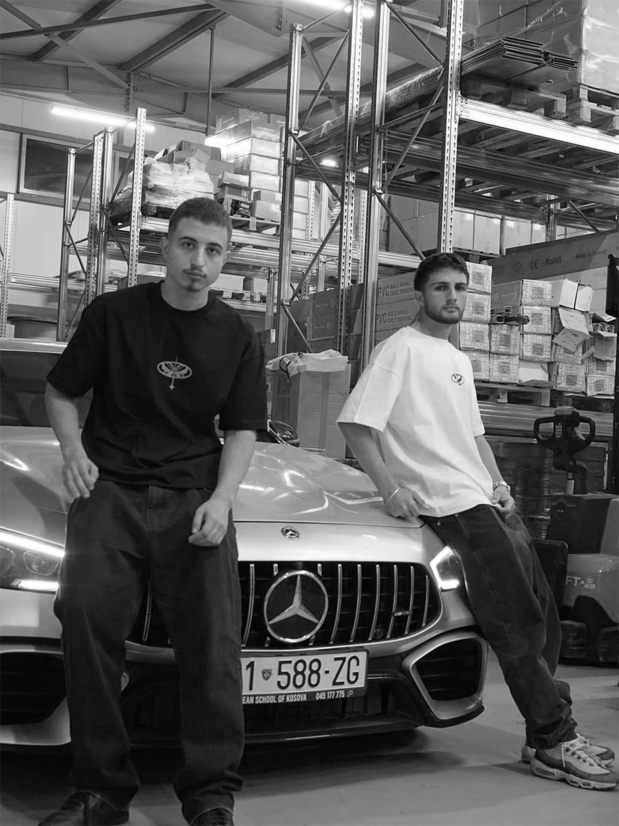
A high-contrast display serif carries the wordmark and headlines, paired with small split location tags like PRIS/TINA and STRE/ETWR. Imagery is dark, grainy and motion-blurred, so the chrome emblem and the garments always do the talking.
Outcome
A complete visual system — emblem, wordmark, colour stages, labels and campaign art direction — that gives Aura Elevate a premium streetwear presence from its very first drop.
Project type
Branding
Company name
Aura Elevate
Industry
Fashion & Apparel


